One quiz says Summer, a photograph tool says Autumn, and the black jacket you like seems to contradict both. Asking “what color season am I?” can become a loop because different systems use different categories and a photograph can shift the colors being judged. A more useful approach is to compare actual fabrics, identify the color qualities you consistently prefer, and keep a provisional palette until a season name earns its place.
Begin with the wardrobe decision you need to make
Choose a concrete question before taking another quiz. Perhaps you need a coat that works with your existing trousers, a softer alternative to white shirts, or a scarf that sits comfortably beside your face. That decision gives the comparison a limit. Sorting every possible color into an approved or forbidden box is a much larger project, and it can obscure the small choices that make getting dressed easier.
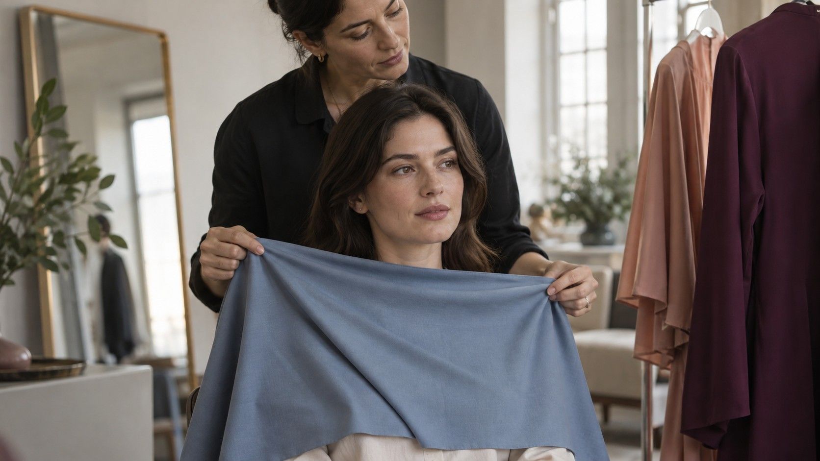
Gather six to ten garments or fabric pieces you already have, including two you often wear and two you tend to avoid. Use clean, similar-sized areas near the face. Stand in indirect daylight with indoor lights switched off where possible. A strong yellow lamp, colored window blind or brightly painted wall can influence the comparison. Keep the background plain and your position steady.
I would write down observations before opening a seasonal chart. “The dark navy works with my features but the pale grey feels weak” is more informative than “I must be Winter.” The observation stays useful if the eventual label changes. Keep personal taste in the picture too: a color you dislike wearing does not become a good purchase because a chart recommends it.
Find the dimension that makes the clearest difference
Personal color systems commonly discuss temperature, value and chroma. Temperature describes a warm or cool impression; value describes how light or dark a color is; chroma concerns its intensity or mutedness. These qualities overlap in real garments. A bright coral may be warmer, lighter and clearer than a dusty burgundy, so that pair cannot isolate one quality. Make the pairs as similar as your wardrobe allows.
For value, compare a light and a deeper version of a related color, such as pale blue and navy. For chroma, try a clear medium blue against a softer grey-blue. For temperature, compare a warm pink or peach against a cooler pink at roughly similar depth. None of these household pairs is a laboratory control. Their purpose is to reveal a repeated preference strong enough to guide the next comparison.
Look for a pattern across several pairs, rather than a dramatic reaction to one cloth. Do softer colors consistently feel easier? Do very pale shades disappear while medium and deep shades give the balance you want? Is warm versus cool the clearest difference, or barely noticeable? You may find that depth is obvious and temperature remains uncertain. Start with the obvious dimension; there is no requirement to solve them in a fixed order.
Contrast deserves its own check. Try a light shirt beneath a dark jacket, then a shirt closer to the jacket's depth. The relationship between pieces can change the effect even when each color appears on a suggested palette. A moderate contrast outfit may suit your preferences better than a stark light-and-dark combination, without changing the season name you provisionally use.
Use the four families as a rough map
In a common four-season framework, Spring combines a warmer impression with clearer colors, Summer a cooler impression with softer colors, Autumn warmth with softness, and Winter coolness with clarity. These are broad styling descriptions. They are not medical categories or scientifically established divisions of people. Expanded systems add light, deep, soft, bright or temperature-led subtypes, and the names do not match perfectly between systems.
| Family | Typical direction in a common framework | Useful comparison to try |
|---|---|---|
| Spring | Warm-leaning and clear | A clear warm green beside a muted warm green |
| Summer | Cool-leaning and soft | A soft rose beside a brighter cool pink |
| Autumn | Warm-leaning and muted | A muted terracotta beside a clearer warm orange |
| Winter | Cool-leaning and clear | A clear cool red beside a muted cool red |
Use this map to select comparisons, rather than treating the table as a typing test. If muted colors are your strongest preference, compare a Summer direction with an Autumn direction. If clearer colors repeatedly work better, compare Spring with Winter. If depth overwhelms everything else, begin with medium-to-deep options from more than one family and narrow the temperature afterward.
A season label earns its usefulness when it predicts several successful clothing choices. If a chart's colors repeatedly disappoint in person, revisit the label or the interpretation of that chart. Printed swatches and screen palettes can differ from actual textiles, so match the general qualities before trying to duplicate a tiny digital square exactly.
When two neighboring seasons both seem plausible
Neighboring subtypes often share enough qualities that a mixed result is unsurprising. Someone comparing Soft Summer and Soft Autumn may prefer muted colors consistently but struggle with temperature. Keep softness steady and compare a cool dusty rose with a warm muted peach, then repeat with another family such as blue-green. Do not compare a very pale pastel from one palette against a very dark brown from the other.
Light Spring and Light Summer share an emphasis on lighter colors in many expanded systems. Test light colors of similar intensity before deciding whether warmth or coolness gives a more comfortable result. Bright Spring and Bright Winter comparisons benefit from keeping clarity and depth reasonably similar. A bright warm red beside a deep muted wine asks several different questions at once.
You may also encounter labels such as Deep Summer that belong to some systems and not others. Before comparing advice, check how each service defines its category. Two people can use different names for a similar group of wearable colors, while identical labels can hide different palettes. Record example shades and their qualities alongside the name so the advice remains understandable later.
If the distinction stays small, keep the shared ground. A muted blue-green or medium rose may be easier to wear than either extreme suggested by rival charts. You can use a neighboring family for a scarf or shirt without declaring that the original category was wrong. A wardrobe needs combinations that work together; it does not require a perfectly exclusive membership.
Keep hair, eyes and selfies from deciding everything
Hair and eye color can suggest comparisons, but they do not determine a season by themselves. A rule such as “brown eyes mean Autumn” leaves out too much variation. Dyed hair, eyebrow products, makeup and colored contact lenses can also influence the impression of the whole face. If hair color is a distraction, loosely cover it with a neutral cloth for one round, then compare again with it visible because that is how you actually dress.
Do not infer a season from ethnicity or from how light or dark the skin appears. Skin depth and the warm-or-cool impression discussed in styling are different variables. A useful comparison considers the person and fabrics together under similar conditions. It cannot be replaced by matching a skin patch to a chart or assuming that a celebrity with similar eyes must share your palette.
Photographs add another layer of uncertainty. Automatic white balance, exposure and beauty processing may change between fabrics. A neutral background that changes color between shots is a warning. Compare in the mirror as well as on screen, keep the camera and light fixed, and avoid filters. If an online result changes when you crop the same image differently, treat that result as tentative.
Build a provisional palette and test it through ordinary wear
Choose a small working set: two neutrals, two everyday colors and one accent. For example, you might test navy and soft white with muted blue-green, rose and a deeper berry. The exact colors should come from your comparisons and existing wardrobe, not from this example. Write down useful limits too, such as preferring medium depth over very pale shades or a softened red over a vivid orange.
Wear those colors in familiar combinations before buying replacements. Check them in daylight, at work and under the indoor lighting where you spend evenings. A color may feel different with a large collar, a small neckline or a patterned jacket. Pay attention to whether it combines with your shoes and outerwear. A flattering swatch that requires an entirely new wardrobe may be less helpful than a close alternative you can wear immediately.
Keep short notes for a few outfits: color, fabric, pairing and whether you would happily repeat it. Separate problems with fit or texture from problems with color. A stiff shirt in the right shade can still feel wrong, while a favorite soft knit may carry a less familiar shade comfortably. This stops every disappointing purchase from becoming evidence against your season.
Return to “what season am I?” when the label would simplify a real choice. If the working palette is coherent, you can leave the name provisional. If you want a consultation, ask which system is used and whether the advice includes actual color comparisons and usable neutrals. The most useful outcome is a set of colors you understand well enough to choose for yourself.