A useful color analysis should leave you with more than a season name. It should show which comparisons matter around your face, explain the limits of those observations and help you choose clothes without treating a palette as a rulebook. Before paying for personal color analysis, it helps to know what the appointment can reasonably demonstrate and which questions to bring.
When two similar tops make your face look different
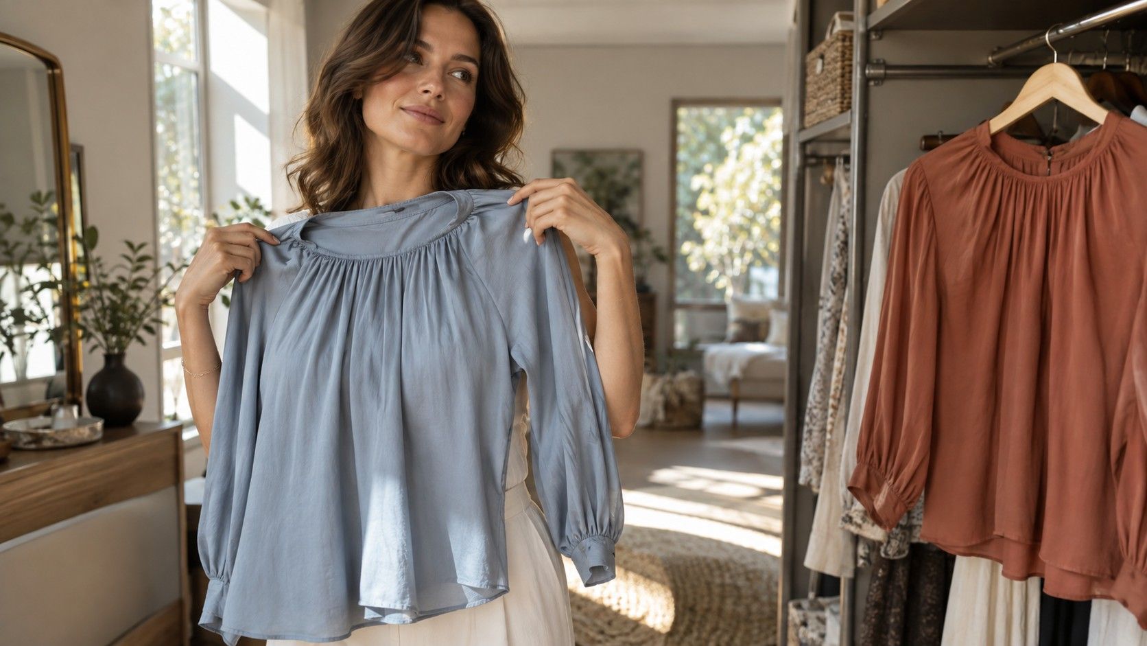
A navy shirt and a cobalt shirt can feel surprisingly different even when their shapes are identical. Color analysis gives you a way to examine that difference. The useful comparison happens with fabric close to the face: look at the relationship between the garment and your features, then change one shade. Looking at a swatch on a desk answers a different question. You may love the swatch while finding the same color distracting in a high neckline.
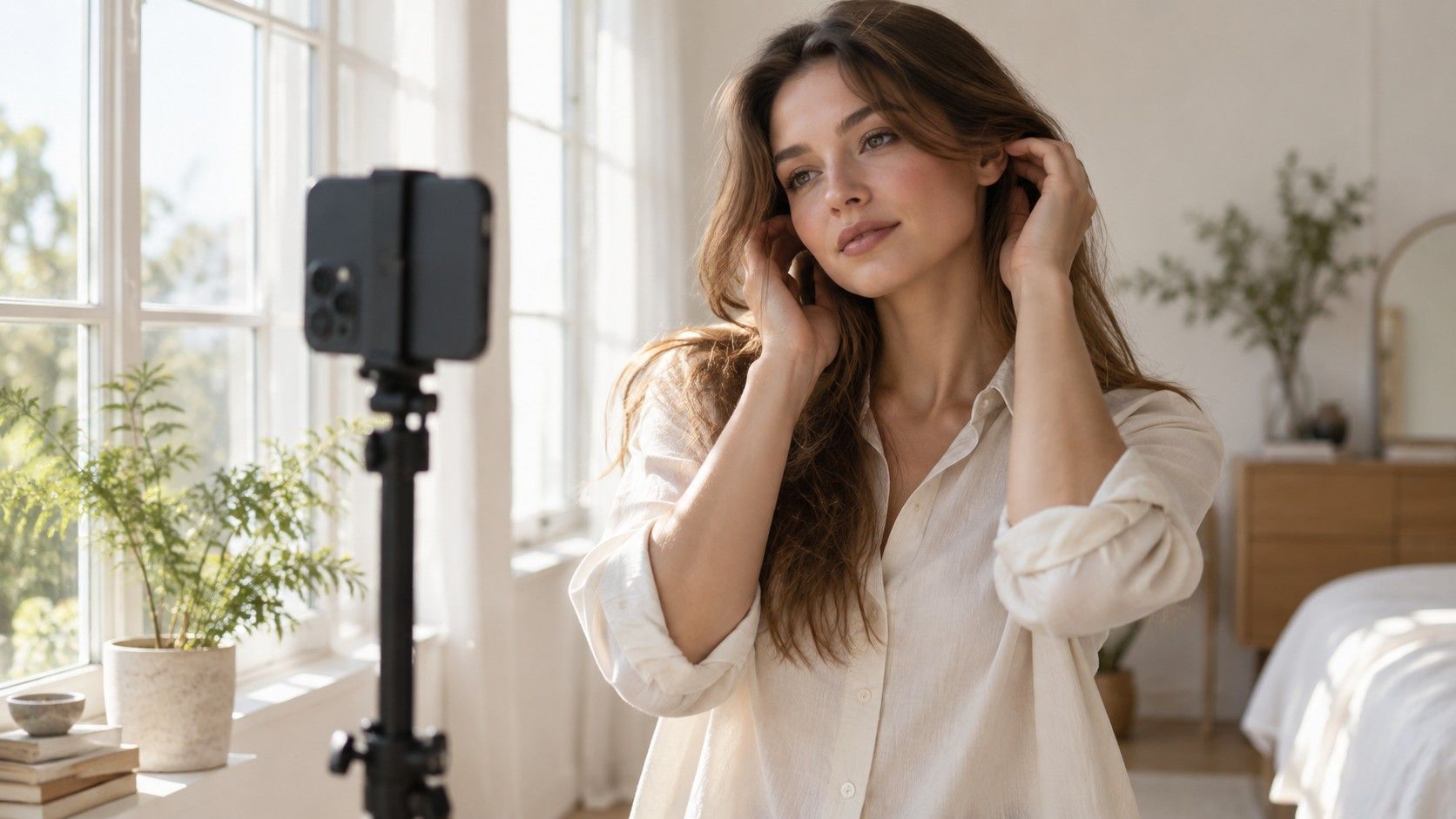
Keep the viewing conditions steady. Indirect daylight, a plain background and a mirror are a reasonable starting point. A sunlit window can throw hard shadows; a yellow lamp changes the apparent color of both skin and fabric. Remove tinted glasses and large reflective jewelry for the comparison. If you normally wear makeup, it can help to look first without it, then repeat a few choices with your everyday makeup before making wardrobe decisions.
Watch several features together. Does the fabric draw your attention before you notice the face? Are the lips and eyes still distinct, or do they seem less defined against that particular shade? Shadows may appear more or less noticeable, but this is a visual styling judgment, not a test of skin health. I would be cautious about any explanation that turns a momentary reflection in a mirror into a diagnosis.
When you need to separate warmth from brightness
A broad warm-versus-cool comparison can be helpful, but it leaves out two other useful dimensions. Value describes how light or dark a color appears. Chroma describes its intensity, from muted to vivid. A light peach and a deep rust may both be described as warm, yet they make very different demands on an outfit. If one works and the other does not, temperature alone has not explained the result.
Compare shades that differ mainly in one dimension where possible. Try a muted blue against a clearer blue of similar depth, rather than comparing pale dusty blue with dark neon green. Ordinary wardrobes rarely contain perfect comparison pairs; acknowledge that limit instead of reading a precise seasonal verdict into an uneven test. A fabric texture or shiny finish can also change how much light reaches the face.
| Question | Useful comparison | What to keep in mind |
|---|---|---|
| Does temperature matter most? | A cooler rose and a warmer coral of similar depth | A brighter shade can distract from the temperature difference |
| How much depth feels balanced? | A light, medium and dark version of one color family | Neckline and surrounding clothes affect the result |
| Do muted or clear shades suit the outfit? | Dusty teal and clearer teal | Compare in the same light and with similar fabric finishes |
Before you book a draping appointment
A useful consultation should make the process understandable before it assigns a label. Ask how the analyst controls lighting, whether the appointment uses physical drapes, and what you will take home. A photograph-based service has different limitations from an in-person session. Neither a polished website nor a long list of seasonal names tells you how carefully the comparisons will be made.
Physical draping generally involves placing different fabrics beneath the face and comparing their effects. The most informative part is the sequence: which pair was compared, what changed, and whether that pattern held across other colors. You should be able to ask why a soft green was preferred over a brighter green. An explanation based only on your eye color, hair color or a quick glance gives you little to use later.
Ask about the scope of the result. Some systems use four seasons, while others divide them into smaller groups; names and boundaries vary. Find out whether your notes will include practical neutrals, contrast examples and workable alternatives to colors you dislike. If you wear a uniform, glasses or a religious head covering, mention that constraint early. A palette that cannot accommodate daily life is an incomplete styling tool.
When the result needs to work with your existing clothes
Start with the garments closest to your face: shirts, scarves, knitwear and jacket lapels. They are easier places to test an observation than trousers or shoes. If a consultation points toward medium-depth muted colors, compare a favorite smoky blue sweater with an equally familiar bright one. Keep their fit and neckline in mind. A flattering cut can make a color seem more successful than it would in an otherwise comparable garment.
A small palette is enough for the first trial. Choose one or two neutrals you already wear, then add two accents that combine with them. Charcoal with muted blue and berry could be one experiment; cream with olive and terracotta could be another. These are outfit examples, not universal prescriptions for particular people. The practical test is whether each accent makes at least two combinations you would actually put on.
There is no need to clear the wardrobe after an appointment. A less preferred shade can move away from the face, sit beneath a jacket or remain a deliberate statement. A scarf may change the balance of a neckline, but it cannot guarantee a particular effect. Use those adjustments when they suit your taste. Clothes also need to meet requirements for work, weather, comfort and care; color gets one vote among several.
When a seasonal label does not quite fit
It is common to like some colors in a suggested season and struggle with others. Before rejecting the whole result, identify the specific mismatch. Perhaps the listed reds are too vivid, or the darkest neutrals feel heavy. A screen may also display a palette very differently from a printed fan. Compare real fabric with real fabric whenever possible, and record what you see instead of trying to match a digital hex code exactly.
Hair dye, makeup and changing contrast can affect the overall appearance you are styling. That does not mean every haircut requires a new seasonal identity. Repeat a few controlled comparisons after a major change and see whether your preferred combinations still work. Natural hair color is not a certificate of temperature, and ethnicity does not determine a season. People with similar coloring can prefer different levels of depth, saturation and contrast.
If two analysts disagree, ask for the underlying observations. One may be emphasizing temperature while another gives more weight to mutedness; their systems may also use different category boundaries. A practical note such as “medium-depth soft blue is easier than icy pale blue” remains useful even without agreement about a label. Personal color analysis earns its place when it improves choices, not when it demands loyalty to a name.
When you want to check the advice after the appointment
Use a short repeatable test over several days. Pick three candidate tops and one familiar reference top. Compare them in the same place at a similar time, without constantly changing makeup or background. Write a sentence about each result: “clear red dominates the outfit” is more useful than “bad color.” Then try the strongest candidates as complete outfits, including the glasses and jacket you normally wear.
Photographs can help you remember combinations, but they are imperfect evidence. Automatic white balance, exposure changes and beauty filters can alter the comparison. Locking settings may reduce some variation, though it cannot make every phone photograph a faithful color record. Give the mirror and the actual fabric more weight than a single flattering selfie. If an online result depends on one image, treat its precision with caution.
After a few wears, review comfort as well as appearance. Do the colors combine easily? Do you reach for them on an ordinary morning? Keep the notes that solve those small decisions and discard rules that create needless shopping. A useful consultation leaves you with a clearer way to compare shades, a few reliable combinations and permission to make exceptions for clothes you enjoy.