Color analysis for men is most useful when it answers an ordinary wardrobe question: which shirt works under this jacket, which neutral deserves the next purchase, or why a familiar combination feels too stark. You do not need a season label before comparing those options. Start with the garments you actually wear near your face, look for repeated preferences in consistent light, and build a small set of colors that combine easily. Seasonal palettes can supply ideas, but they remain styling frameworks with boundaries that vary between systems.
Begin at the collar, where a small change is visible
A shirt, T-shirt, sweater or jacket collar places color close to the face. That makes the neckline a sensible place to begin. Leave trousers, socks and shoes for later; their color can matter to the outfit, but testing everything at once makes the result harder to interpret. Select two tops of similar shape and fabric so a better fit does not win a comparison intended to be about color.
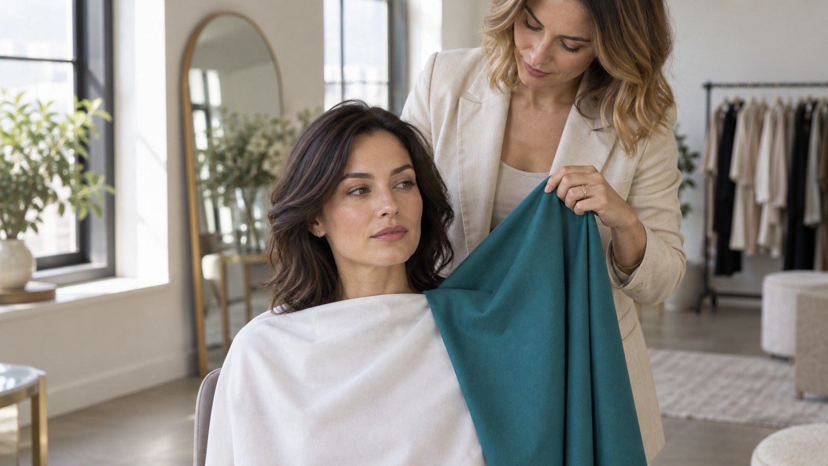
Stand facing indirect daylight with a plain background. Avoid a bright window behind you, direct sun across one cheek or a warm lamp beside the mirror. Hold each fabric beneath the chin, keeping the same amount visible. Look at the whole combination, then repeat the swap. The question is which result you prefer and can reproduce, rather than whether one color appears to erase every normal shadow or line.
Keep facial hair in its usual state for the first round. A beard changes the distribution of dark and light areas around the face, so test the look you normally wear. If you alternate between clean-shaven and bearded, repeat the comparisons when the appearance changes. Hair color, eye color and skin depth can suggest options to investigate, but none determines a season alone. Ethnicity supplies no shortcut either.
I would keep the first notes plain: “medium blue works with both jackets” or “this black crew neck feels stronger than I want.” Those observations are easier to use in a shop than an uncertain seasonal category. You can add a label later if it helps describe a pattern already visible in the clothes.
Compare white, cream and blue with the same jacket
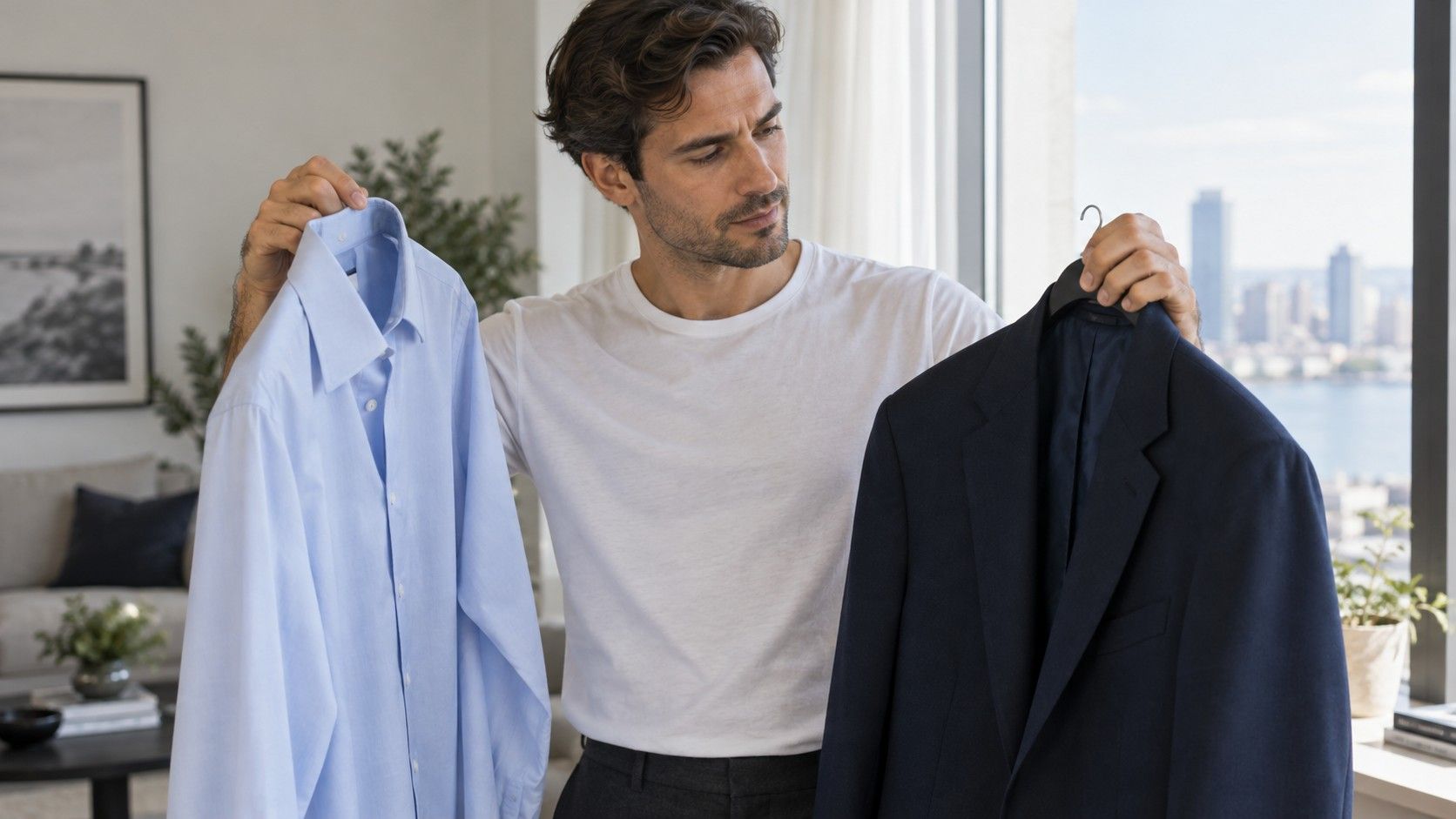
Three common shirt directions provide a manageable test. Compare a clear white, a warmer cream and a blue at a depth you would realistically wear. Keep the jacket unchanged and, where possible, use shirts with similar collars. White and cream differ in their color impression, but the particular fabrics may differ in brightness too. Write down what you see rather than treating the pair as a perfect test of undertone.
Check the shirt both with the jacket open and with it fastened. An open jacket reveals a large color area; a buttoned jacket leaves a smaller panel and the collar. You may find that bright white feels stark alone yet works well in the smaller area. A blue shirt can reduce the light-dark jump against navy, while a cream shirt may create a warmer overall combination. None is a universal winner.
| Comparison | Keep steady | Useful question |
|---|---|---|
| White versus cream shirt | Jacket, collar shape and daylight | Which light neutral is easier beside the face? |
| Pale blue versus medium blue | Similar fabric and jacket | Do you prefer a lighter or deeper shirt area? |
| Clear blue versus grey-blue | Approximate depth and neckline | Does clarity or softness work better? |
| Shirt alone versus under a jacket | The shirt and lighting | Does reducing the visible color change your preference? |
Shop descriptions are only rough clues. Ivory can be almost white or visibly yellow; blue can lean green, violet or grey. If a certain cream shirt disappoints, it does not prove that every warmer neutral will fail. Compare another version before making a broad rule. The useful result is a specific shirt direction that works with the jackets and knitwear you already own.
Choose jacket neutrals by building complete combinations
Navy, charcoal, brown, olive and black each contain many variations. A navy jacket can look clean and cool or slightly softened; brown ranges from orange-toned tan to deeper, quieter shades. Hold candidates beside two shirts you wear regularly. If both combinations work, the jacket has a practical advantage over a color that looks appealing alone but requires new supporting pieces.
Consider the size of the color area. A suit puts its neutral across most of the outfit, while a casual overshirt can be broken up by a T-shirt and different trousers. Before committing to a suit, view the fabric near the face and step back to inspect the full effect. A small swatch held at waist level cannot show the same relationship. Check the jacket under daylight as well as the shop lighting if that is possible.
Separate color from formality and texture. A smooth black suit, washed black denim jacket and black knit cardigan share a color name but serve different jobs. Similarly, a flecked brown tweed looks different from a smooth brown suit fabric. Color analysis cannot fix a mismatch between garment and occasion. Choose the required type of clothing first, then compare colors within realistic alternatives.
If your job requires navy or charcoal, focus on the choices around them. A shirt, knit layer or tie can adjust the color near your face without replacing the uniform. You can prefer charcoal with medium blue and navy with softened white, for example. There is no need to force one shirt neutral to serve every jacket if a small, coordinated set works better.
Use ties, layers and patterns to control contrast
Contrast describes relationships, not an isolated garment. A pale shirt beneath a dark jacket creates a larger light-dark difference than a medium shirt beneath the same jacket. Try both before assuming that a seasonal label requires strong contrast. You might enjoy a crisp combination for a formal event and a closer range of values for an ordinary workday.
A tie can connect the shirt and jacket, add a clear accent or increase the visual interruption between them. Test its width and visible area along with its color. A small burgundy pattern on navy behaves differently from a solid vivid red tie. If the outfit feels busy, remove one competing element: use a plain shirt with a patterned tie, or keep the tie quiet when the jacket has a noticeable check.
For casual layers, compare a light T-shirt under a dark overshirt with a medium T-shirt under that same piece. Check how much of the inner layer shows at the neck and through the opening. A narrow light edge can provide enough definition without a large pale block. A deep green T-shirt beneath navy might produce a quieter result, provided the two fabrics remain distinct enough for your taste.
Patterns can make a color easier to use by reducing its uninterrupted area. A shirt with small light markings on a medium ground is different from a shirt split into equal broad dark and light stripes. Judge it from a normal conversation distance. Close-up inspection can exaggerate tiny colors that barely register when the garment is worn.
Make casual colors work with what is already in rotation
Start with the jeans, chinos and outerwear that leave the house most often. If your base is dark denim and a navy jacket, compare several tops beside that pair: muted green, medium grey, warm off-white or berry, according to your preferences. The point is to find useful combinations, not to include every suggested color. A small wardrobe benefits from repeated connections between pieces.
Keep intensity in mind. A clear blue T-shirt and a dusty blue T-shirt can be similar in depth but feel quite different. Compare them with the same trousers and layer. If one seems too strong, try changing the visible area before rejecting it. An open neutral shirt can break up a bright color; a large crew neck leaves more of it exposed. Conversely, a muted outfit may need a lighter neckline or deeper layer to gain definition.
Your existing favorites deserve attention. Place a well-used top beside one you rarely choose, then ask what differs beyond color. Fit, fabric, collar height and comfort can all affect the preference. A scratchy sweater in an otherwise successful shade is weak evidence against that shade. Color analysis becomes less confusing when it is one part of the clothing decision rather than an explanation for every disappointing purchase.
There is no requirement to discard a useful exception. Black trousers can stay while you explore softer colors near the face. A warm leather bag can work away from the neckline even if cooler shirts are your preference. Placement and proportion allow flexibility, and enjoyment is a valid reason to wear a color.
Keep a working palette and check it before buying
Build a starting set around two neutrals, two shirt or knit colors and one optional accent. Choose them from successful outfits, not solely from a digital chart. For example, navy and charcoal might support medium blue, softened white and burgundy. A warmer wardrobe might use brown and olive with oatmeal, muted blue-green and terracotta. These are possibilities to compare, not prescriptions attached to gender or appearance.
Photograph the successful combinations in steady daylight if that helps you remember them. Keep the same camera settings and avoid beauty filters. Automatic white balance can shift color between pictures; a neutral wall that suddenly looks warmer is a warning. Saved images are useful records, but the actual fabric comparison should carry more weight than a screen whose brightness or color mode changes.
Before purchasing, ask whether the item makes at least two outfits with clothes you own and whether it suits the occasions you dress for. Check unfamiliar shades at home in daylight while returns are still possible. If a season name helps narrow the search, use it provisionally and retain your specific color notes. The lasting result of color analysis is being able to choose another shirt or jacket with less guesswork.