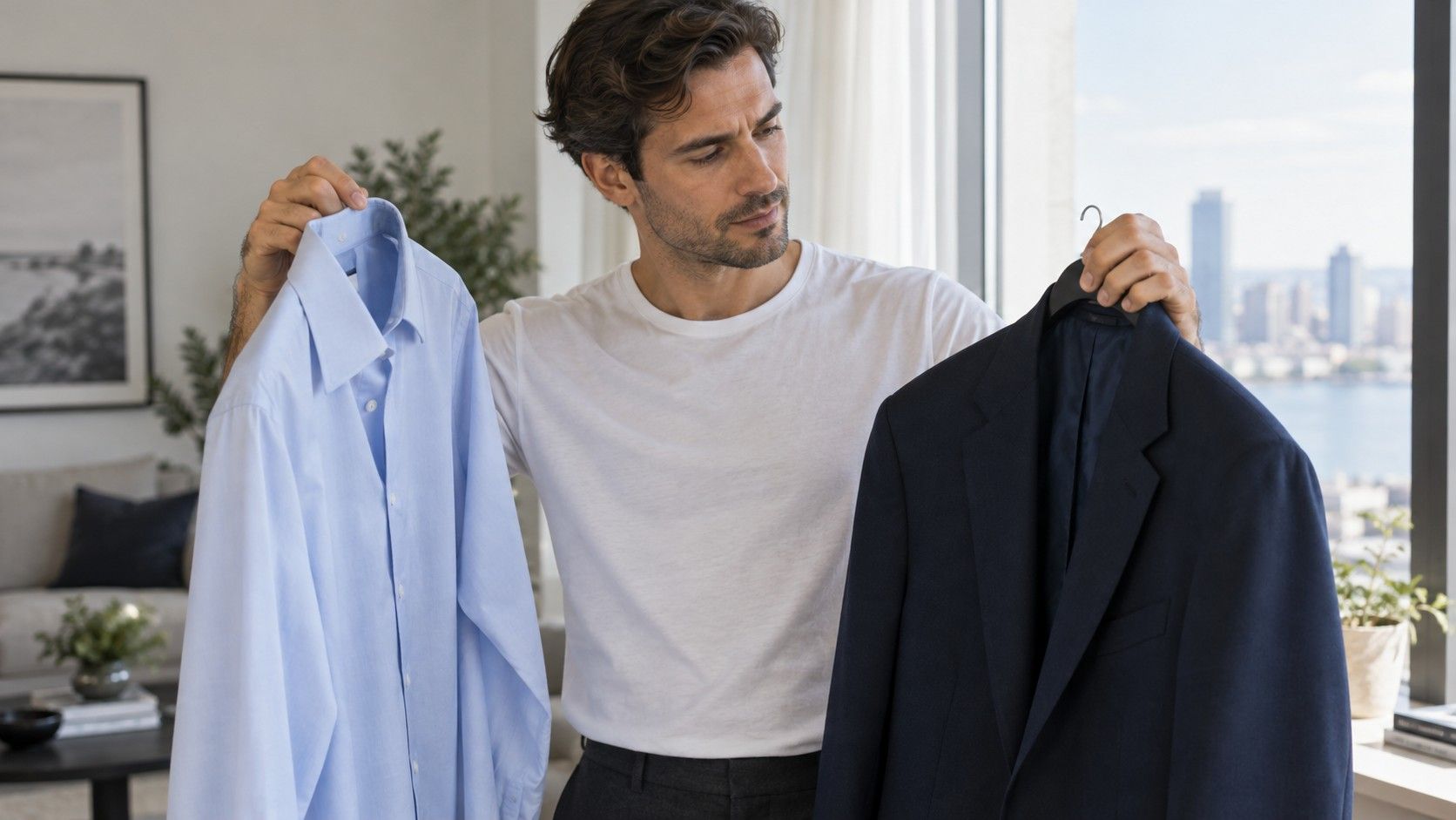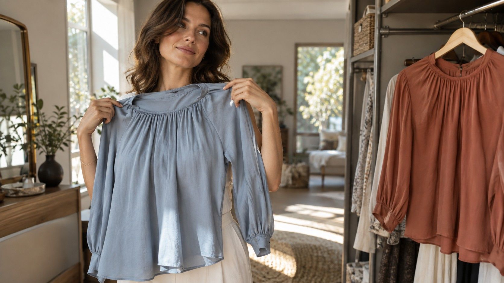
An online color result can make a confusing wardrobe feel suddenly organized: a season, a neat grid of shades, perhaps a list of colors to avoid. The useful question comes after that moment. Does the advice still help beside a window, with your own clothes and no screen filter? I would treat color analysis online as a way to choose better comparisons, then judge it by those comparisons. A label earns its place when it explains repeatable preferences and makes getting dressed easier.
Find out what the quiz actually uses
A color analysis quiz may ask you to name your eye color, select a foundation shade, or decide whether gold looks better than silver. Another tool may sample pixels from a photograph. A remote consultant may review several images and discuss the result with you. These approaches collect different evidence. A questionnaire mostly rearranges your own descriptions; a photo tool interprets an image whose lighting and processing it may not understand.
Before entering answers, look for an explanation of the method. Does the service compare warm and cool colors, lighter and darker values, and clear and muted shades? Does it show the images that led to its recommendation? A bare season name offers little help if you cannot see which of those dimensions mattered. Terms such as value and chroma are useful here: value describes lightness, while chroma describes how intense or muted a color appears.
Questions can also force a false choice. Hazel eyes may not fit a single swatch; naturally dark hair can contain several tones; jewelry preference may reflect a wedding ring you always wear. If none of the answers fits, record the uncertainty instead of changing your description until a preferred season appears. The uncertainty belongs to the quiz, and should remain visible in how much weight you give the result.
Make one photograph that you can repeat
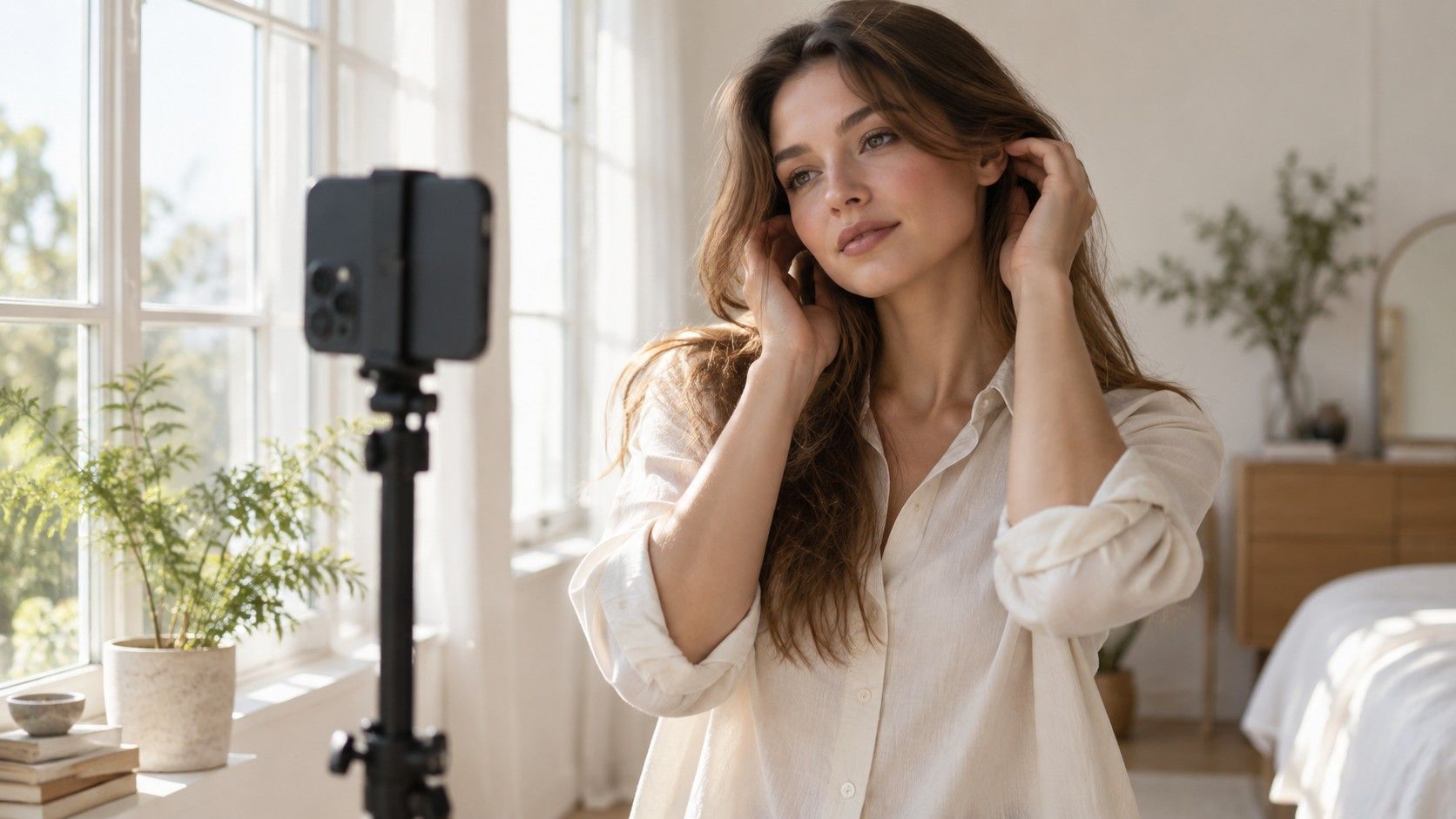
Use indirect daylight near a window, with the window facing you rather than sitting behind your head. Switch off nearby lamps that cast a visibly different color. Avoid a bright blue wall, a colored curtain, or a vivid shirt directly below the face: reflected color can become part of the picture. A plain, quiet background makes the image easier to inspect, though no household setup removes every lighting variable.
Remove tinted glasses and strong lip or cheek color when practical. Keep the hair away from the face if the tool asks for it, especially when its color has been changed. Follow the service's actual framing instructions and use the same camera for later comparisons. Do not add a beauty filter, a portrait effect that alters skin, or an edit intended to make the photograph more flattering. The purpose is a consistent reference, not a polished portrait.
Phone cameras can change white balance, exposure, and contrast between shots. A white shirt is a useful warning sign if it turns blue in one image and cream in another, but it is not a professional calibration target. Take a few images in the same position and inspect them together. If the face looks noticeably different across that short set, pause the analysis and improve the setup. Sending more inconsistent images does not necessarily create better evidence.
Read the palette before accepting the season
Suppose one tool returns Soft Summer and another suggests Soft Autumn. Their names disagree, yet both may be pointing toward muted colors and moderate contrast. That shared observation can be tested with clothes. Compare a dusty blue with a clear royal blue of roughly similar depth, then compare two muted shades that differ in warmth. This separates the decisions instead of treating the entire seasonal system as a single yes-or-no verdict.
Different systems draw their seasonal boundaries differently. A twelve-season chart and a smaller four-season quiz may divide similar colors under different labels. Even within one chart, a screen swatch may look different on your laptop and phone. Save the written explanation as well as the palette, and note the specific qualities it recommends. “Muted medium-depth colors” is a more portable shopping clue than a season name without context.
I would be cautious with a result that claims certainty from one casual selfie. Personal color categories are styling frameworks, and a photograph carries limitations. A useful report can acknowledge a close neighboring palette, explain a difficult comparison, and suggest how to check it. Confidence percentages do not tell you much unless the provider explains what the number measures and how it was assessed.
Use actual clothes to test a small claim
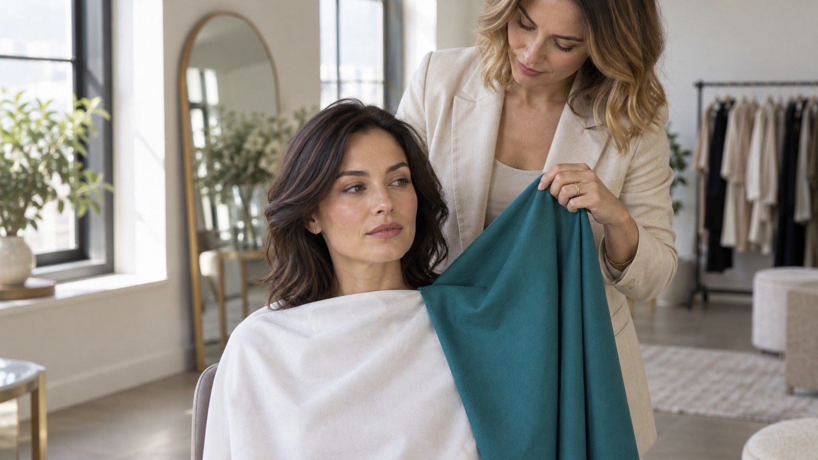
Choose two solid fabrics with similar texture and coverage. A matte cotton T-shirt compared with another matte cotton T-shirt is easier to judge than sequins beside wool. Hold each below the chin in the same daylight, without changing your position. Look at the whole face before staring at the fabric. You are deciding whether you prefer the balance, whether the color feels easy to wear, and whether it gives the effect you want.
A bright color can create a lively look even when it becomes the first thing you notice. A muted color can feel calm without being your favorite. Neither response needs to be dressed up as a measurable improvement in skin. Record plain observations such as “the navy works with my usual glasses” or “the pale beige leaves less definition than I want.” Those notes support a wardrobe decision more clearly than searching for an invisible perfect match.
| Online suggestion | Useful comparison at home | Keep the check fair |
|---|---|---|
| Choose cooler shades | A blue-leaning red beside an orange-leaning red | Use similar depth and brightness |
| Try softer colors | Dusty blue beside a clearer blue | Keep fabric texture similar |
| Use deeper colors | Medium gray beside charcoal | Keep both fabrics near the face |
| Lower outfit contrast | Navy with blue-gray beside navy with white | Compare complete outfits in one light |
Repeat the strongest comparison on another day before buying anything. If a recommendation works only in one photograph, keep it provisional. Start with a scarf, an existing shirt, or a borrowed fabric sample. Replacing a coat because an app dislikes its color is an expensive way to test a weak conclusion, especially when that coat already fits your clothes and daily routine.
Check the photo policy and the purchase screen
Free color analysis may end with a free label and a paid explanation. That can still be useful, provided the boundary is clear before you upload. Check what is included, whether a payment renews, whether a human review is offered, and what happens if the photograph cannot be assessed. Save the order details if you pay. A palette download, a consultation, and an ongoing subscription are different purchases.
A face photograph deserves a deliberate choice. Read the current policy for image storage, deletion, sharing, and any use for model training. Look for a way to request deletion and check whether that applies to the uploaded photograph as well as the account. If the explanation is vague, choose a questionnaire or work with fabrics offline. You do not have to trade a portrait for a color suggestion.
After the test, keep a compact working palette of colors you have checked rather than a folder full of contradictory screenshots. Include two everyday neutrals, a few colors you enjoy, and a note about preferred contrast. Revisit it when a recommendation fails in real clothing. The best outcome is a smaller number of useful decisions: which shirt to try, which neutral to repeat, and which attractive swatch can stay on the screen.