A soft autumn color palette can look easy on a swatch card and frustrating in a shop. Everything is called beige, olive or terracotta, yet some pieces are pale and chalky, others orange and intense. The useful thread is softness with a warmer leaning, usually expressed through colors that feel gently muted rather than vivid. Treat this as a direction to compare against your clothes. Seasonal categories are styling tools with varying definitions, and a name should help you dress rather than turn shopping into a rule test.
Test softness before filling the wardrobe with orange
Soft Autumn is often associated with earthy colors, but that description can send you toward rusts and mustards that are much stronger than you want. Begin by comparing a muted warm color with a clearer version of similar depth. A softened peach beside a bright coral, or a dusty olive beside a clean yellow-green, can show whether reduced intensity is the quality you prefer. Keep the finish similar so shine does not become the main difference.
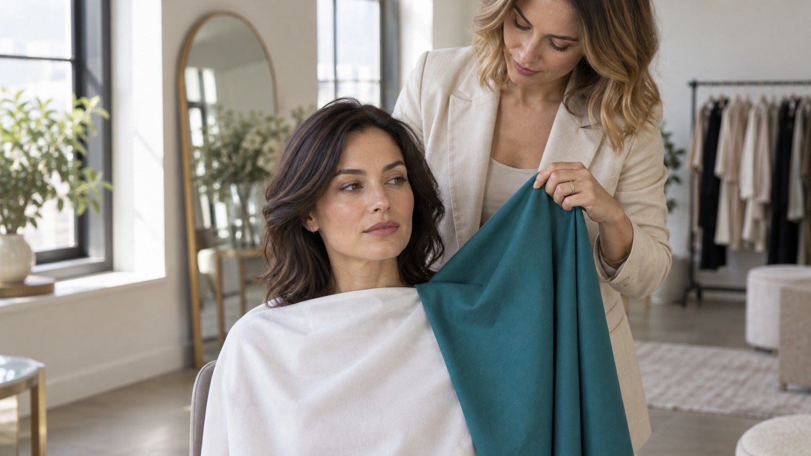
Hold the fabrics near your face in indirect daylight. Use a plain background and switch off a nearby warm lamp if possible. Look at the whole relationship between face and fabric, then repeat with another color family. If softness consistently feels easier while the warmer option varies, you have learned something useful even without settling a season. You may need a narrower range of warmth than an online palette suggests.
Lightness matters too. A very pale oatmeal sweater and a deep muted brown share a general earthy impression but create different contrast. Compare medium values before concluding that all light or dark colors are unsuitable. A reasonable starting point is a handful of medium, softened shades; expand toward pale or deep options when an actual outfit gives you a reason.
I would be cautious about any chart that makes every color look equally compulsory. A wardrobe can use a small corner of a palette. If muted green and warm rose work while mustard never feels comfortable, there is no need to purchase mustard to complete the category.
Make the neutrals earn their space first
Warm taupe, softened brown, oatmeal and muted olive are common neutral directions to compare. Color names are imprecise. Taupe can lean pink, green or grey, while camel may be golden and strong rather than soft. Put potential pieces beside the trousers, shoes and jacket you already own. A neutral deserves the name because you can use it repeatedly, not because it appears in a row at the bottom of a palette.
Choose one deeper neutral for structure and one lighter option for contrast. A medium brown trouser with an oatmeal knit gives you a base for several accents. Muted olive trousers can work with a warm rose top if their depth and intensity feel balanced. For a coat, test the actual collar beside your face; a tiny swatch on a screen cannot show how a large area of color will feel.
Avoid buying several nearly matching beiges at once. They may have different undertones, and a pair that seems coordinated in separate photographs can look awkward together. Lay the garments side by side in daylight, then try them on. If two tones are too close to look intentional, separate them with a shirt or choose a clearer difference in depth. Matching exactly is only one way to build an outfit.
White also comes in variations. Compare a softened warm white with a bright white shirt at the same neckline. You may prefer the gentler version, or find that the bright shirt works when a muted jacket reduces its visible area. Keep a useful item if the complete outfit succeeds. Replacing every neutral before testing combinations is an expensive way to answer a small color question.
Use accents to give muted outfits a point of interest
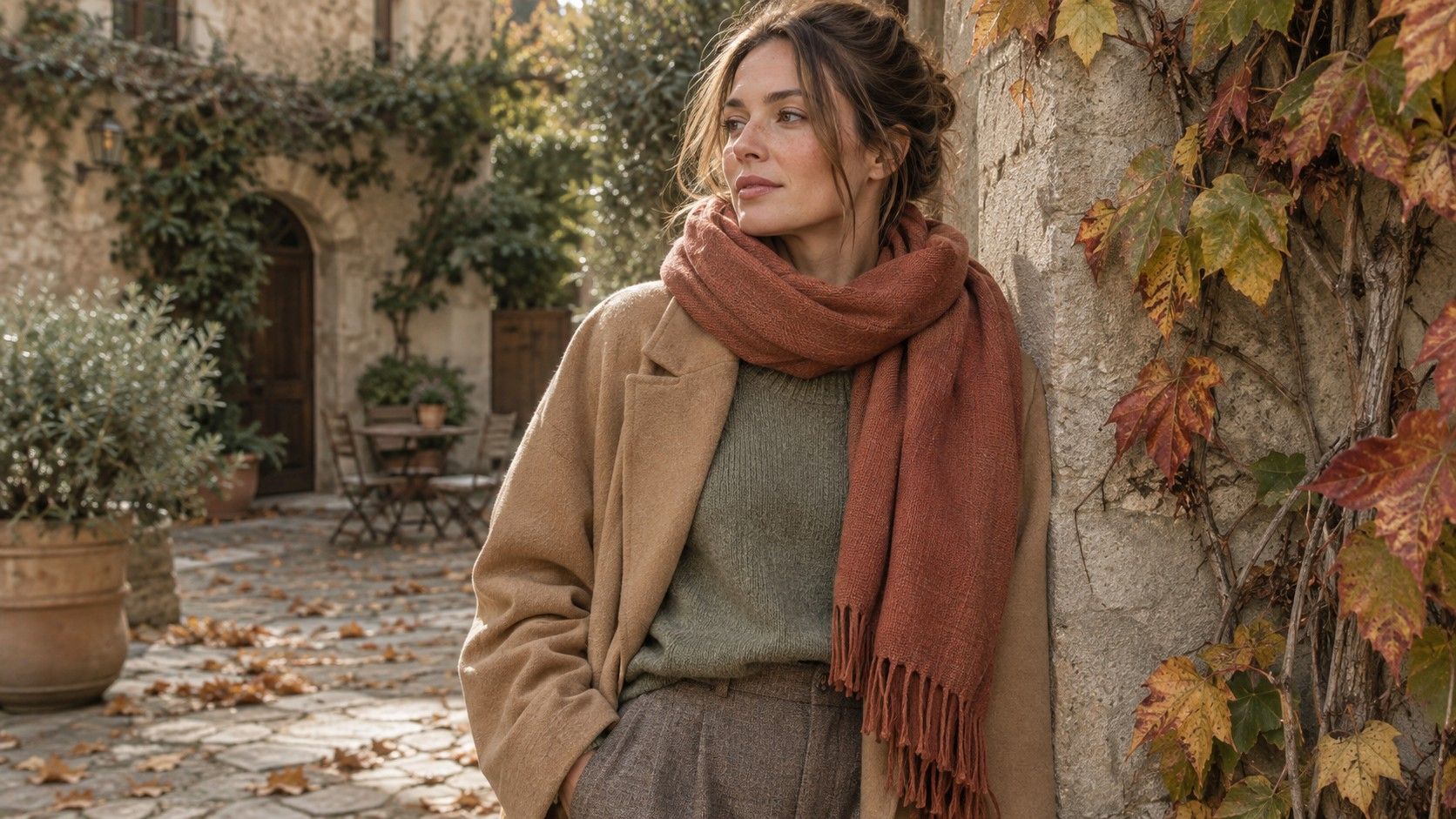
Softness does not mean every piece must be beige. Muted rose, dusty peach, softened terracotta, sage and quiet blue-green can introduce variety without an abrupt jump in intensity. Test the actual textile: a product photo labeled sage might show a cool grey-green or a warmer yellow-green. Either could be useful, but the name alone cannot establish which one fits your working palette.
Build one outfit around two related depths and one distinct accent. For example, medium brown trousers and a taupe overshirt leave room for a muted rose T-shirt. An olive skirt can sit beside a soft warm-white top with a terracotta scarf. These are comparison ideas, not guaranteed formulas; check whether your particular fabrics share enough softness and whether the proportions feel right.
If an outfit feels dull, increase the difference between its pieces before increasing brightness. A deeper brown belt, a lighter neckline or a visible change in texture may provide enough definition. A bright orange accessory could be enjoyable, but it will have a different role from a muted orange one. Decide whether you want it to blend into the outfit or deliberately catch attention.
Patterns are useful when they connect colors already in the wardrobe. Look at the background color and the largest shapes first. A print with a muted olive base and small warm rose details may coordinate more easily than one with equal areas of black, white and orange. Hold the printed piece beside two plain garments you own. If it works with both, it has a practical job beyond looking appealing on the hanger.
Compare Soft Autumn and Soft Summer without changing everything
These neighboring families share an emphasis on muted colors in many seasonal systems. Their warmer or cooler leaning is a common point of distinction. To test that, keep softness and depth as similar as you can. Compare a warm muted peach with a cool dusty pink, then a warmer muted green with a cooler blue-green. A bright coral against pale icy blue would mix too many variables to clarify the boundary.
Look for repeated preferences, not a single winning photograph. If warmer muted colors work in several families, Soft Autumn may be a helpful starting label. If the cooler versions consistently feel easier, explore Soft Summer. You might prefer a shared middle ground and find the more extreme ends of either palette difficult. Keep that result; an uncertain boundary does not erase your useful colors.
Camera white balance can change the very distinction you are trying to judge. Keep a neutral object or wall visible and watch whether it becomes yellow or blue as fabrics change. If it does, use the mirror comparison as your main reference and repeat the photos with steadier settings. A selfie tool's answer should remain provisional when the same setup produces inconsistent images.
Hair and eye color can prompt comparisons, but they cannot settle the category. Dyed hair, makeup and lighting alter the overall impression. Skin depth does not determine warmth, and ethnicity does not determine a season. The useful evidence is how actual fabric choices behave together in conditions you can repeat.
Let existing cool or dark pieces keep a role
A Soft Autumn experiment does not require disposing of black trousers, cool denim or a navy jacket. Begin by placing a preferred muted color near your face and keeping the harder-to-combine piece farther away. A warm taupe knit above black trousers creates a different effect from a black high-neck sweater. A scarf or open shirt can also change how much of a contrasting color is visible.
Look for a bridge color in prints or accessories. A muted patterned scarf containing both warm brown and softened blue can connect a cool denim jacket to a warmer top. The connection should be visible in the actual outfit; a tiny speck of blue in a print may do little from a normal viewing distance. Step back from the mirror rather than inspecting the pattern only at arm's length.
Use texture when a color feels too stark. Washed denim, brushed knitwear and matte cotton often read differently from smooth, glossy fabrics in similar shades. That does not change the color's technical category, but it changes the outfit you see. The label is less important than whether the garment fits your preferences and combines with the pieces around it.
If a favorite cool shirt remains a favorite after several comparisons, keep it. You might enjoy its contrast, associate it with a good fit, or simply like the color. Personal color analysis has no reason to overrule that choice. Reserve stricter palette matching for purchases where you want the easiest possible coordination.
Test a small capsule before making a shopping list
Pick five colors from items you already wear: a deeper neutral, a light neutral, two everyday colors and one accent. A possible set is softened brown, oatmeal, muted olive, warm rose and dusty blue-green. Substitute freely according to your comparisons. Assemble several outfits and check whether each color works in more than one combination. The exercise should reduce uncertainty about purchases.
Wear the combinations in the settings that matter to you. Office lighting can make a subtle shade look different from daylight, and evening light may reduce the distinction between two muted colors. Consider how the clothes look under your coat, with your usual shoes and beside a bag. A palette that works only as isolated fabric squares is still unfinished wardrobe advice.
When shopping, compare candidate items with a garment you own rather than relying only on saved swatches. Product photography and phone displays can change warmth and depth. Recheck at home in daylight while returns are possible. Buy one gap-filling piece, use it, then decide whether the palette needs another shade. Soft Autumn becomes useful through these repeated, ordinary decisions, with enough flexibility to keep the clothes you enjoy.