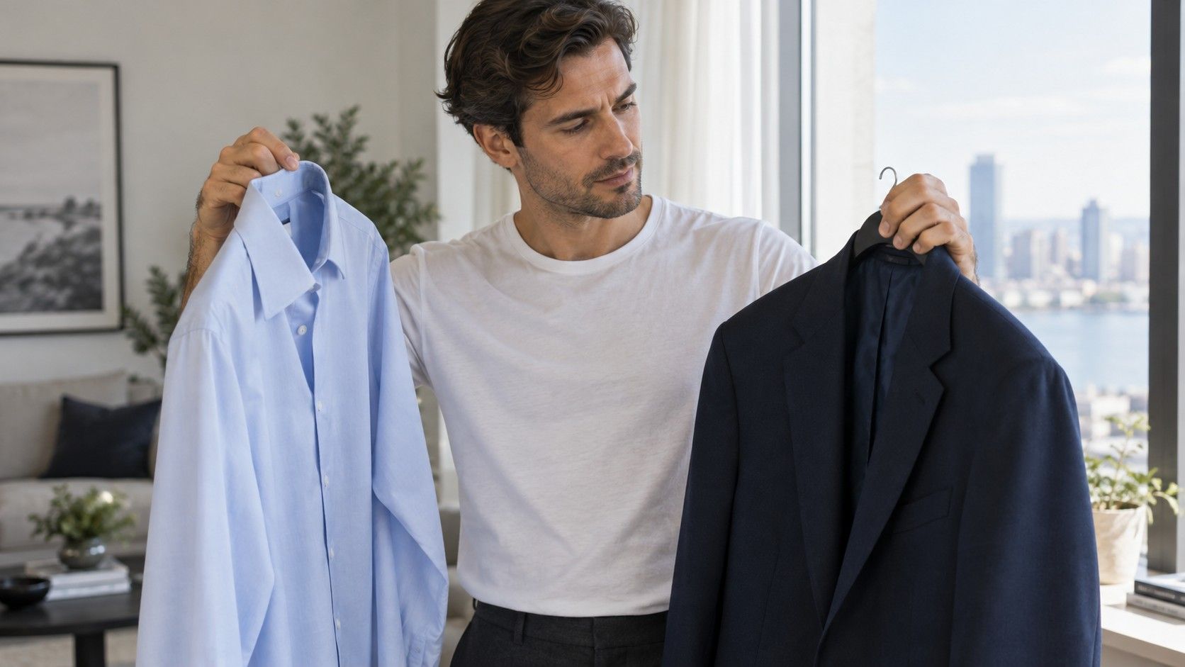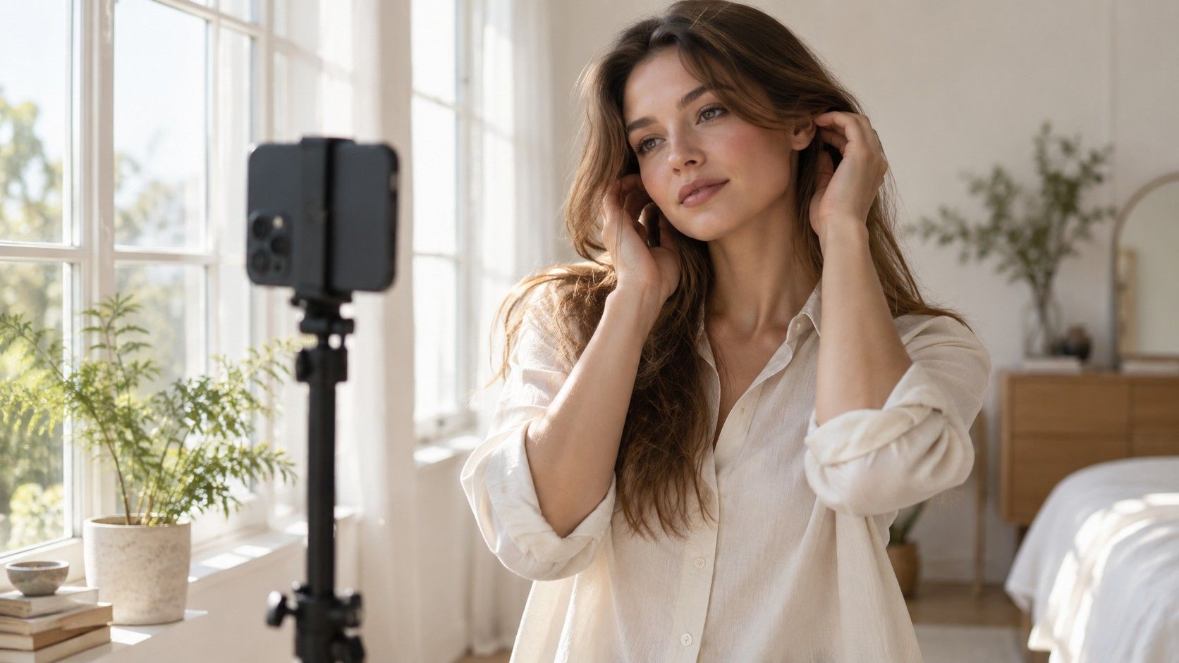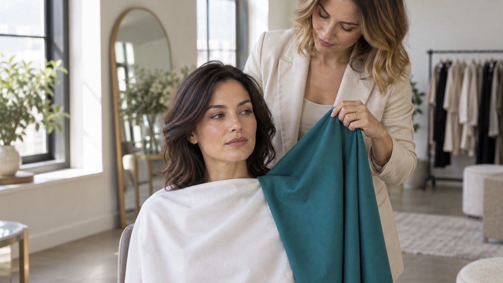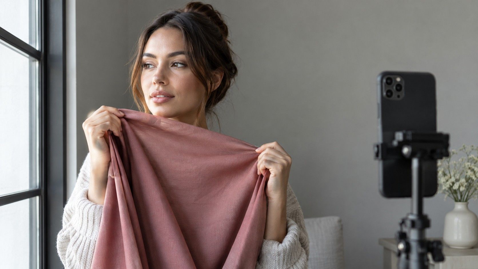
A camera can turn the same face peach in one photograph and grey in the next. That makes a skin undertone test with a camera useful for recording comparisons, but a weak basis for a verdict from one selfie. The practical aim is smaller: keep the light, framing and camera behavior steady enough to see whether a warm or cool fabric gives you a result you prefer. Treat the pictures as notes about clothes, with room for uncertainty.
Check whether the camera is changing the answer
Start by taking two pictures a few seconds apart without moving. Then place a large blue or orange garment near the bottom of the frame and take another. If the wall, your face and a pale neutral object all shift color together, the phone is probably adjusting its interpretation of the scene. That shift can be mistaken for evidence that the fabric changed how your complexion looks. Look at the background as carefully as the face.
Automatic white balance tries to render the scene in a plausible way. It does not know that you are conducting a clothing comparison. Exposure adjustments, portrait processing and beauty filters can introduce further differences. A screen preview may also differ from the saved image. Switch off optional filters and retouching, use the same camera throughout, and check the actual saved files before making notes. A feature called natural or original can still involve processing.
I would give a repeatable pair of ordinary photographs more weight than an app's confident label. A label does not show which part of the image drove its answer. If removing a colorful cushion from the background changes your suggested undertone, the setup needs attention before the result deserves any.
Find even daylight and make the background boring
Face a window with indirect daylight, leaving enough distance for the light to fall evenly across both cheeks. Avoid a stripe of sun across the forehead, a bright window behind you, or a yellow lamp shining on one side. Turn off indoor lights for the comparison when possible. If your room is strongly tinted by a colored blind or a nearby wall, move elsewhere; a window alone does not guarantee neutral light.
A plain grey or off-white background makes changes easier to spot. Move bright bedding and large colored objects away from the frame. Wear a neutral layer that can be covered by the test fabrics, remove tinted glasses, and keep strongly colored jewelry out of view. For an undertone comparison, bare skin is usually easier to interpret than foundation, bronzer or colored sunscreen. You do not need to inspect every freckle; you need comparable conditions around the face.
Keep your head at the same angle and the camera at roughly eye level. Support the phone on a stable surface and mark where the chair stands. Use a comfortable distance that includes the whole face, neck and a little fabric. Moving closer between shots changes the composition and can alter how the phone meters the scene. A slightly untidy but fixed arrangement is more useful than several beautifully framed pictures taken in different places.
Lock what you can before swapping fabrics
If your camera offers exposure and white-balance locks, set them before the fabric sequence and leave them alone. Controls differ between devices, so use the settings your camera actually provides. An exposure lock may leave white balance automatic. Check this with the colored-garment test instead of assuming that one lock symbol freezes everything. Avoid changing lenses, zoom or portrait mode midway through a sequence.
Take the full set within a short period while daylight is steady. Passing clouds can change brightness and the mix of light in the room. If a cloud arrives halfway through, repeat both fabrics under the new conditions instead of comparing one sunny shot with one cloudy shot. Keep a small neutral object visible in the same position as a reference. It cannot calibrate the photograph by itself, but a conspicuous change in it is a reason to distrust the pair.
| What changes between pictures | Why the comparison becomes weaker | What to do |
|---|---|---|
| The wall turns warmer | The camera or light may have shifted overall color | Repeat the pair and check white-balance controls |
| One cheek becomes much brighter | Your angle or direction of light changed | Reset the chair and face the window evenly |
| Skin looks smoother only in one shot | Processing may be changing texture or contrast | Disable optional portrait effects and retouching |
| Fabric loses its visible detail | Very bright areas may be overexposed | Reduce exposure and repeat the complete pair |
When locks are unavailable, consistency still helps. Keep the neutral background dominant, use similar-sized fabrics and repeat a sequence twice. If the apparent winner changes on the second pass, record the result as inconclusive. Repetition is useful here because it reveals instability, not because taking more photographs makes an uncertain label become a fact.
Compare fabrics that ask one clear question
Begin with a warm-leaning and a cool-leaning version of a similar color: a peach beside a pink, for example, or a warm red beside a blue-based red. Choose fabrics of broadly similar lightness, intensity and finish. Comparing a pale peach T-shirt with a dark glossy burgundy scarf mixes several variables. You may prefer the pale fabric because it is lighter, regardless of temperature.
Hold each cloth under the chin without covering the neck. Let it occupy a similar area in every picture, and keep it still enough to avoid reflected folds and shiny highlights. Matte cotton is often easier to compare than sequins or satin because the finish adds fewer distractions. There is no need to buy a draping kit immediately: a few garments already in the wardrobe can reveal whether the method is giving you consistent information.
Study the same areas in each photograph: around the mouth, beside the nose, beneath the eyes and along the jaw. Ask which fabric makes the overall combination look balanced to you. Avoid turning normal shadows or skin texture into a problem that clothing has to solve. A useful note sounds like “this medium pink is easier beside my face than this orange,” rather than “all warm colors are forbidden.”
Repeat with another color family before drawing a broader conclusion. If two reds suggest cool but two greens produce no preference, that is a mixed result worth keeping. Temperature is only one dimension. Lightness, softness and the contrast between a garment and your features can matter more to your preference than the warm-versus-cool distinction.
Read the screen cautiously, then check the clothes in person
View comparison photographs on the same screen with a consistent brightness setting. Disable optional display modes that visibly warm the image or change its colors for the viewing session. A phone in evening mode beside a laptop at full brightness can give you two different impressions of the same file. Neither screen provides a personal color diagnosis. Do not compare a screenshot from one device with an edited portrait from another.
Put the pair side by side and crop them similarly if your viewer allows it, keeping the original files. Look at the face before staring at the fabric. An attractive garment color can win your attention even if the combination is difficult to wear. Then return to the mirror in the original light and swap the actual fabrics again. If the photograph says one thing and the mirror consistently suggests another, the photograph should remain a doubtful piece of evidence.
A skin undertone test can support a shopping decision without assigning a season. You might learn that medium, slightly muted blues are dependable, while very pale beige feels flat. That information is already usable for a shirt or scarf. Keep three or four specific successful colors in your notes, including the lighting conditions, rather than storing only a warm, cool or neutral badge.
Stop when the pictures cannot settle the question
Step away from the test if daylight keeps changing, the phone keeps shifting the background, or every comparison produces a different answer. Repeating an unstable setup for an hour usually adds contradictory pictures. Try another short session on a different day with the same fabrics. Keep both sessions and see whether any preference survives. No consistent preference is a valid outcome.
Vein photographs, a single wrist close-up and a digital color sampled from a cheek do not provide a dependable shortcut. Reflected light, camera processing and the exact spot selected can change what you see. Skin depth and undertone are different ideas, and a camera's pink or yellow pixel cannot establish an entire wardrobe category. Seasonal systems are styling frameworks; their labels need not agree across services.
If you seek help from a stylist, send the setup details alongside unfiltered images and ask how uncertainty is handled. Useful advice should explain comparisons and give wearable examples. For your own wardrobe, keep the final test practical: wear the preferred color near your face in ordinary daylight, with the clothes you already own. If it is easy to combine and you enjoy the result, the camera has done enough.