Foundation looks peach at the jaw, a pink beige looks separate from the neck, and both warm and cool clothing charts seem slightly unconvincing. That is often where people start investigating an olive skin tone. The term can be a useful description of appearance, but it does not hand you a finished wardrobe. I would use it to refine comparisons: less emphasis on finding one correct label, more attention to depth, mutedness, and the colors that remain comfortable in ordinary daylight.
Start with depth before choosing a warm or cool label
In beauty and styling language, olive often describes a greenish, gray-green, or subdued yellow-green impression in the skin. It is used across a wide range of depths. Fair olive skin and deep olive skin can share that descriptive quality while needing quite different foundation depths and outfit contrast. Olive is not a synonym for tanned, medium, or Mediterranean, and ancestry cannot decide which clothing colors you will prefer.
First describe what you can compare without a season chart. Is your skin relatively light, medium, or deep compared with available foundation swatches? Does a medium gray shirt feel clear enough beside your face, or do you prefer charcoal? Are pale colors easy to wear, or do they need a darker collar or glasses for the balance you like? These are wardrobe observations, not biological categories.
A cool olive skin tone is a styling description people use when cooler colors seem more comfortable despite a yellow-green impression in the complexion. Other people who describe themselves as olive prefer warmer colors or a mixture. That variation is a reason to test shades, not a problem that needs explaining away. Two people can use the same undertone word and build different palettes because their preferred depth and intensity differ.
Compare the face and neck without chasing redness
The cheeks can appear pinker than the neck, and one part of the face may look warmer than another. Cosmetics, recent activity, lighting, and the camera can complicate the picture. Do a clothing comparison in indirect daylight, with strong makeup removed if practical, and look at the face, jaw, and neck together. A single pink area is a poor basis for assigning an entire palette.
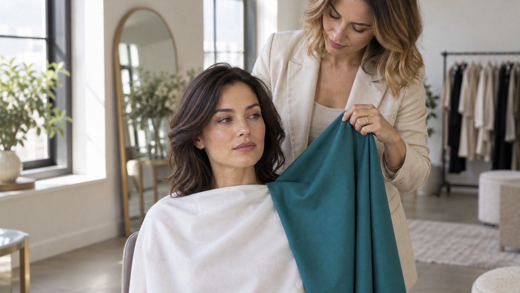
Keep the room setup simple. Face a window, turn off lamps with a strong yellow cast, and move away from vivid walls or curtains. A green top can reflect color upward, which is an awkward starting point when you are specifically looking for a greenish appearance. Begin in a quiet neutral and then bring each test fabric into the same position below the chin.
Vein color and jewelry tests can produce uncertain answers. Veins seen through skin are affected by the viewing conditions, while a preference for gold may reflect its finish, size, or familiarity. If both metals work, write that down. There is no need to manufacture a decisive answer. A matte silver hoop and a polished yellow-gold necklace are also changing several things at once, so their comparison is less tidy than it first seems.
Test softness separately from temperature
When every warm-versus-cool comparison feels close, mutedness may be the more useful question. Try a subdued teal beside a brighter turquoise, or dusty rose beside a clearer pink, keeping their depth reasonably similar. Then test warmth with two similarly muted colors. This avoids comparing a pale dusty mauve with a vivid orange and attributing the entire difference to temperature.
Pay attention to the effect you actually want. A clear red may look bold and deliberate; a soft burgundy may feel easier for everyday wear. Neither preference proves an undertone. Look at how the color works with your hair, glasses, eyebrows, and usual styling. If you wear strong eyeliner daily, compare the clothes in that context after the initial simple test. Your finished wardrobe has to work with your life.
| If this happens | Try this comparison | What it may help you decide |
|---|---|---|
| Warm and cool colors both feel too strong | Muted teal beside bright turquoise | Whether reduced intensity is useful |
| Muted colors feel flat | Soft rose beside clear raspberry | Whether you prefer more visible color |
| Light beige seems indistinct | Beige beside mushroom or a deeper brown | Whether depth or the neutral's hue matters more |
| Black feels too severe | Black beside charcoal, navy, and deep brown | Which dark neutral gives your preferred balance |
Do not assume that wearing olive green will automatically suit olive skin. A yellow khaki, a gray sage, and a deep forest green have quite different characters. Compare them as separate colors. The same caution applies to beige: a pink beige, a yellow beige, and a grayish beige are not interchangeable, even when a shop calls all three “natural.”
When foundation looks orange, separate shade from formula
A foundation can be the right depth and still look too peach, pink, yellow, or saturated. On someone using olive as a complexion description, an orange-looking match may indicate that its hue is unsuitable; it does not automatically mean the foundation is too dark. Compare a small amount near the jaw with the neck in daylight, following the product's instructions and using cosmetics you already tolerate.
Allow the swatch to settle before deciding. A wet stripe can look different after it dries, and some formulas change appearance during wear. Compare the same product at application and later under similar light. If the whole face appears different only beneath a store lamp, check another light source before blaming the shade. Phone photographs can add another color shift, so avoid treating a selfie as the final judge.
Shade names are local to the brand. “Neutral,” “golden,” and “olive” do not promise a consistent color across ranges. When shopping, note the actual behavior of a sample: too pink at the jaw, too yellow next to the neck, correct depth but too vivid. Those details make the next comparison more useful. A sample or a clear return policy can matter more than a confident online shade description.
Color correctors can alter a cosmetic mixture, but they also introduce another variable and do not repair a mismatched formula. Follow the manufacturer's mixing guidance rather than improvising with unrelated pigments. If finding a base becomes frustrating, a lighter-coverage approach or using less product may give the finish you prefer. Wearing foundation is optional; it should not become a requirement for testing clothes.
Build a small palette from results you can repeat
Choose one dark neutral, one lighter neutral, and three colors from clothes you already own. Navy, charcoal, mushroom, cream, burgundy, and teal are possible candidates to compare, not a universal olive palette. Put each next to the same face under the same light. Record the exact garment or fabric, since a color name alone can hide a large difference in depth and saturation.
For each successful color, check a complete outfit. A cream shirt may feel too pale alone but work under a navy jacket; a bright scarf may provide exactly the contrast a quiet sweater needs. Colors worn at the ankle or carried in a bag have a different relationship to the face from a high collar. You can keep a favorite color by adjusting placement, pattern, or the size of the area it covers.
Repeat the close comparisons on another day and keep the notes short. “Muted burgundy works with charcoal trousers” tells you more in a shop than an uncertain season diagnosis. If two colors remain equally appealing, keep both. Personal color analysis is a framework for organizing styling choices, and it does not need to eliminate every ambiguity to be useful.
Before buying a large item, ask whether its color connects to at least two outfits you actually wear. A coat in a successful neutral may serve you better than an exact-looking seasonal swatch that clashes with the rest of the wardrobe. Let olive remain one helpful description among several. The durable result is a set of shades, contrasts, and combinations you understand well enough to choose again.