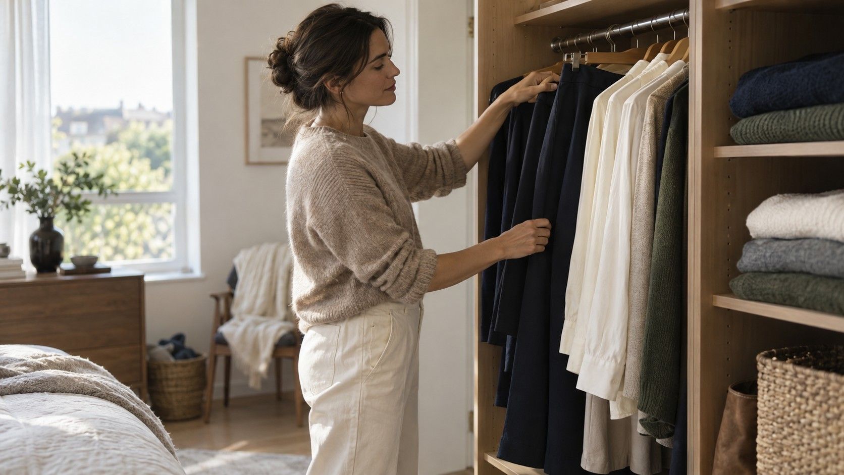
You can find a useful color palette by making better comparisons with the clothes already in your wardrobe. The aim is a small group of shades that work together, suit the way you dress and make buying less uncertain. A season label can wait. Start with the pieces you reach for, test a few alternatives beside your face and give the resulting combinations time in ordinary life.
When your wardrobe already contains the first clues
Take out the clothes you have worn repeatedly during the current season, including ordinary work tops and weekend layers. Keep a second group for things you admire but rarely put on. The difference can reveal more than a saved board of attractive swatches. A rarely worn blouse may be the wrong size, difficult to wash or too formal; do not blame its color until you have checked those practical reasons.
Lay the repeat pieces together and look for patterns. Perhaps you use navy as a base, prefer medium rather than very pale shades, and add green more often than red. Write those observations in plain language. You do not need a seasonal name yet. A palette built from these habits has a chance of working on a rushed Tuesday, which is a more demanding test than looking good as a row of squares.
Choose three reference garments: one you reliably enjoy near your face, one whose color feels uncertain, and one useful neutral. Keep them available for later comparisons. Try to select similar necklines and fabrics if your wardrobe allows it. A silk blouse and a heavy sweatshirt reflect light differently, so a comparison between them cannot isolate color. That limitation is manageable once you recognize it.
When you need two neutrals that do useful work
Neutrals are the colors that connect your outfits, not a compulsory list of black, white and beige. Deep brown, navy, charcoal, olive and soft ivory can all serve that role in different wardrobes. Start with a dark or medium neutral you already own in several pieces. Then choose a lighter companion that works with your shoes, outerwear and the laundry routine you are willing to maintain.
Test the pair as actual clothes. A navy trouser and an ivory top may combine easily, while two almost matching charcoal fabrics can look unintentionally mismatched. Look at the clothes in daylight and under the lighting where you spend time. The purpose is to catch surprises before a purchase, not to demand a perfect match under every bulb. Texture can make a close tonal combination feel more intentional.
If black is central to your wardrobe, keep it while you explore alternatives. You can experiment with a softer neckline or a different top without replacing trousers, bags and shoes. Similarly, white does not need to be banned because cream seems easier beside your face. Compare the specific garments. “Off-white” covers many shades, some yellowish and some grayish, and a store label rarely tells the whole story.
When accent colors look better on the hanger than on you
Bring two or three accent candidates to an indirect daylight spot with a plain background. Hold each fabric beneath your face, keeping the other test colors out of view. Look for a balanced relationship between the color and your features, rather than expecting a dramatic transformation. You are choosing an effect you like. Color comparison does not diagnose skin conditions or reveal a fixed biological category.
Change one feature at a time where you can. Compare muted green with clearer green, or a medium blue with a deeper blue. Comparing pale lilac with vivid orange changes temperature, depth and intensity together, making the result harder to interpret. If the available clothes do not make controlled pairs, note your general preference and leave the explanation open. Uncertainty is a better shopping companion than a confident but shaky rule.
Take notes that name the actual garment: “the dusty blue crewneck works with my navy jacket” is actionable. “I am definitely cool” is much broader than the evidence. Check your strongest choices again with your normal glasses and everyday makeup. Hair color and lipstick can change the overall balance of the look you are assembling, so the most useful palette belongs to your current routine.
When you want a palette that produces complete outfits
Choose a modest starting group: two neutrals and three accents are plenty for a trial. Each accent should work with at least one neutral and ideally with another accent. If you love rust but cannot combine it with anything you wear, let it remain a favorite color outside the wardrobe for now, or test it in a small accessory. A palette does not have to contain every color you enjoy seeing.
| Wardrobe role | Example trial color | Check before keeping it |
|---|---|---|
| Main neutral | Navy | Works with existing trousers, jacket or shoes |
| Lighter neutral | Soft ivory | Looks intentional with the main neutral in ordinary light |
| Everyday accent | Muted teal | Makes two outfits from clothes already owned |
| Second accent | Berry | Feels comfortable near the face and fits your usual settings |
| Optional detail | Dusty rose | Adds a useful combination rather than duplicating another purchase |
The table is an example of roles, not a palette prescribed for everyone. Substitute brown, camel, olive or clear blue if those are more useful to you. Spread the garments on a bed and assemble three whole outfits, including footwear and outerwear. Gaps become obvious there: a pale accent might need a layer you do not own, or two favorites might compete when worn together. Solve the combination before buying the missing item.
When a phone result gives you a different answer
A digital tool can offer colors to try, but a photograph is an unstable starting point. White balance, exposure, reflected light and image processing can change apparent skin and clothing colors. A warm bathroom bulb may produce a different recommendation from a window portrait taken minutes later. If you use an online tool to find my color palette, keep its result as a set of test candidates rather than a final shopping instruction.
Use photographs to record outfits under similar conditions, with filters disabled. Avoid comparing a sunny outdoor photograph with a dim indoor selfie. Even consistent settings cannot guarantee faithful screen color, and two displays can show the same swatch differently. For a purchase, compare the physical garment with something you trust from your wardrobe. A saved photograph is useful context, but it is a poor substitute for fabric.
A seasonal system can organize the results if you enjoy that framework. Warmth, depth and mutedness are often more portable notes than a disputed season name. You might discover that medium, softened shades are easiest while still being unsure about temperature. Keep that partial finding. You have enough information to make a better next comparison without forcing every observation into a single category.
When you are ready to spend money on the palette
Wear the trial combinations for a week or two before changing the shopping list. Note which outfits you repeat, which feel too formal and which need more effort than you want to give them. If a shade looks pleasing in the mirror but stays unworn, the issue may be its fabric, cut or role in your life. Buy for the gap you can name, such as a washable layer for two work outfits.
Take a reference garment or a physical swatch when shopping if that is practical. Store lighting can make a subtle beige look greener or warmer than expected, so check the return conditions and inspect the item at home before removing labels. There is no need to chase a precise digital color value. A slightly different shade may make a better outfit because its texture, depth and fit work with what you own.
Keep a short record with your two neutrals, the accents that survived the trial and three combinations you like. Revisit it when your routine or preferences change. The question “what is my color palette” becomes easier when it means “which colors help me get dressed now?” You can add an unexpected red, keep a sentimental sweater and still have a coherent wardrobe. The palette is useful when it reduces hesitation, wasted purchases and the number of clothes waiting for an imaginary occasion.