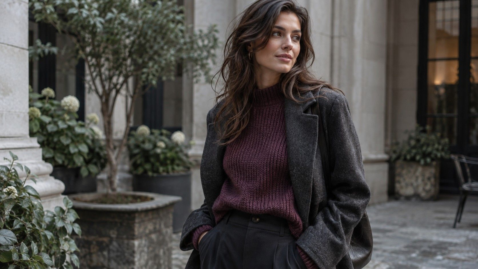
Deep Summer can be a helpful description when pale colors feel too light and very clear dark shades feel too strong. It is also a nonstandard season name: its meaning changes between practitioners, and many systems do not use it. Before treating a deep summer color palette as a shopping list, translate the label into comparisons of depth, softness, temperature and contrast that you can test with real clothes.
When you receive a Deep Summer result
Ask which seasonal system produced the label before buying a palette fan or changing your wardrobe. Deep Summer is not a universal category across color-analysis systems. Some practitioners use a term like deep soft summer for a deeper part of a muted, cool-leaning palette; other systems organize similar observations differently or do not use the name at all. A familiar title can therefore conceal different sets of swatches.
The useful information is the description behind the label. Does the recommendation favor medium-to-deep shades, reduced intensity, a cooler direction, or a particular level of contrast? Ask for examples that separate those qualities. A statement such as “smoky navy is easier than clear cobalt” gives you something to compare. A season name without those observations is hard to translate at a clothes rail.
Keep a copy of the specific palette you were shown and the system or consultant attached to it. Do not merge several online images merely because they share the heading Deep Summer. One may lean toward muted plum, another toward brighter wine shades. That disagreement does not have to be solved as a universal classification problem; you need a consistent starting set for your own reversible comparisons.
When you test depth without making everything darker
Start with shades that let you compare depth within a similar family: a soft medium blue, a smoky navy and a near-black navy, for example. Hold each fabric close to the face in indirect daylight. Notice whether the darkest option supports the overall look or becomes the first thing you see. A deep label does not require the deepest possible version of every color.
Keep one familiar top as your reference. Test candidates with a similar neckline and finish where possible, because shiny fabric and open necklines change the amount and placement of reflected light. If you only own unlike garments, note that limitation. A comparison between a pale linen shirt and a dark satin blouse tells you something about those outfits, but it does not isolate depth cleanly.
Include medium shades in the experiment. Dusty berry, slate blue and a subdued teal can provide relief beside dark neutrals without creating a sharp light-dark jump. These are candidates, not guaranteed flattering colors. If the medium shade is more comfortable and easier to combine, keep it. A useful deep summer color palette should leave space for the clothes you actually want to wear.
When Summer looks too pale and Winter looks too sharp
An overlap in practical preferences can explain why the label appeals to some people. You may like muted colors associated with Summer descriptions but want more depth than a particular pastel-heavy palette offers. At the same time, clear saturated shades or stark black-and-white combinations may feel stronger than you want. Describe that observation before deciding which neighboring season name should own it.
Compare real shades rather than seasonal mood boards. Try a smoky berry against a clearer berry of similar depth, then a softer navy against a very crisp dark blue. Keep the rest of the outfit steady. If you change temperature, depth and intensity all at once, it becomes difficult to identify what helped. You may discover that softness matters more than coolness, or that a little extra contrast works well with your glasses.
| Comparison | What to notice | Possible wardrobe response |
|---|---|---|
| Pale dusty blue versus medium slate blue | Whether a little more depth improves balance | Use medium blues for tops and paler shades as smaller details |
| Muted plum versus clearer purple | Whether intensity distracts from the face | Keep the softer option for large areas |
| Charcoal and soft gray versus black and white | How much contrast feels deliberate | Build tonal combinations if the sharp pair dominates |
| Smoky teal versus very dark teal | Whether the darkest shade becomes heavy | Keep some medium accents beside dark neutrals |
When you need dark neutrals for ordinary outfits
Look at navy, charcoal and softened dark brown as potential starting points, rather than assuming black must disappear. The exact fabric matters: a washed black knit looks different from a glossy black jacket. Compare each with a top you already enjoy. The best neutral for your wardrobe needs to work with your shoes, outerwear and usual level of formality as well as beside your face.
Build one tonal combination to test gentler contrast. A charcoal trouser, medium slate top and smoky navy jacket can show how neighboring depths work together. Then compare it with an outfit using a much lighter top. Neither arrangement is automatically correct. You are checking whether the sharper contrast is a useful statement or makes dressing harder than it needs to be.
If black is required for work, use the comparisons where you have room to choose. A shirt collar, scarf, pair of glasses or layer beneath a jacket can alter the balance near the face. There is no obligation to buy all of them. Try the change with something already owned, and keep it only if the resulting outfit is more useful. A seasonal label should adapt to a uniform, not turn it into a daily problem.
When an accent color needs to earn its place
Choose two or three accents from your tested group and give each a specific job. A muted berry knit might work with navy trousers and a charcoal skirt; a smoky teal shirt might sit beneath two jackets. If an appealing plum only works with an outfit you do not own, postpone it. Buying one color often creates pressure to buy its companions, which defeats the purpose of a more coherent palette.
Take special care with color names used in shops. Burgundy may describe a brownish red, a cooler wine shade or something brighter; teal covers a wide range of blues and greens. Compare the physical item with a reliable reference rather than accepting the label. Store lighting can obscure a subtle difference, so inspect the garment at home while it is still returnable if the purchase conditions allow that.
Patterns can make a palette more flexible. Look at the overall effect from normal viewing distance, then check whether one of its colors connects with an existing neutral. A print need not contain only approved swatches to work. The scale, contrast and placement matter too. If the pattern feels busy near your face, try it below the waist or beneath a plain layer before dismissing every color in it.
When the label starts creating more rules than choices
Avoid treating hair and eye descriptions as entry requirements. Dark hair does not establish Deep Summer, and pale eyes do not exclude a deeper muted palette. Ethnicity cannot assign a seasonal category. The meaningful evidence for this styling task is how specific clothing comparisons work in consistent conditions and how you want the finished outfit to look.
Phone images can help record combinations, but automatic white balance and exposure make them unreliable arbiters of fine color differences. Use similar lighting, disable filters and give the actual fabric more weight than a screen swatch. If an app repeatedly changes its answer between photographs, keep the useful candidate colors and leave the precise category unresolved. A confident label is not worth more than a repeatable comparison.
After several wears, keep a small working palette with dark neutrals, medium accents and any lighter shades that proved useful. Add a plain-language note about contrast and intensity. You can call that collection Deep Summer if the system helps you navigate it, or use the description alone. The successful result is a set of combinations you reach for, with enough flexibility for a favorite color that falls outside the suggested range.