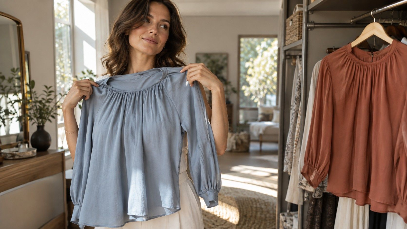
Two similar tops can make a better starting point than a long list of colors you are supposed to avoid. One goes on easily; the other remains on its hanger, even though you liked it in the shop. A simple color test for clothes helps you investigate that difference with fabrics you own. I would keep the first comparison small, look at the complete effect around the face, and record a decision you can use on a shopping trip. You do not need to settle on a season before choosing a shirt.
Set up a comparison that does not change with every top
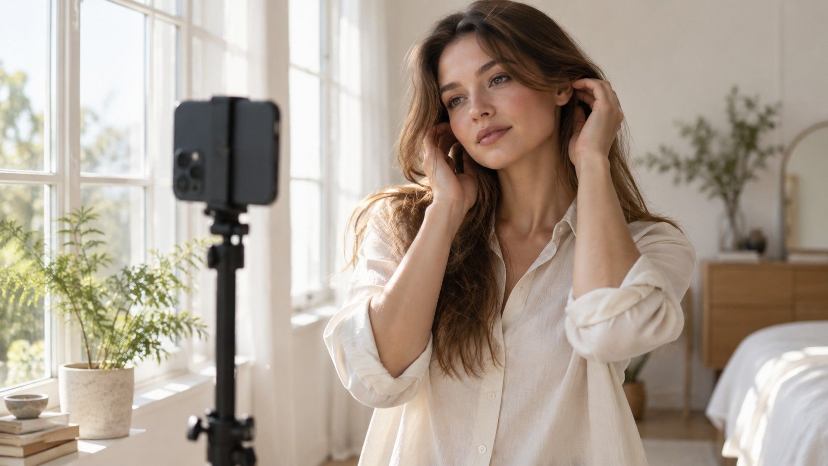
Stand or sit facing a window in indirect daylight. Direct sun can create bright patches and deep shadows that distract from the fabrics. Switch off nearby lamps if they add a visibly different color, and avoid a position beside a strong-colored curtain or wall. Use the same mirror, position, and distance for both tops. Consistency matters more than turning a room into a studio.
Start with two solid fabrics that cover a similar area below the chin. Two matte cotton T-shirts are easier to compare than a shiny blouse and a thick patterned jumper. If you are holding garments against you, tuck away the unused fabric so both occupy roughly the same space. Keep your shoulders in the same position. Small changes in angle can alter the light on the face and make the comparison harder to interpret.
For the initial check, keep strong lipstick, tinted glasses, and brightly colored accessories out of the comparison where practical. Then return to your usual styling when you test the complete outfit. If glasses are an everyday part of your appearance, you will eventually want the clothing to work with them. There is no value in finding an idealized palette for a version of yourself you never dress.
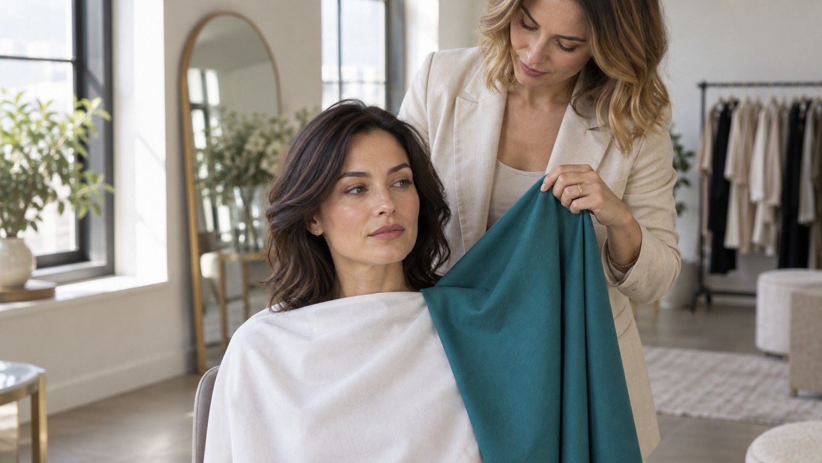
Use a neutral cloth over the unused top if changing shirts repeatedly becomes distracting. You can also ask someone to hold the two fabrics one at a time, provided the room and your position stay the same. Avoid racing through a pile of twenty colors. Begin with one decision that matters, such as choosing between navy and charcoal for a jacket you intend to buy.
Ask one color question at a time
Colors vary in temperature, value, and chroma. Temperature is the relative warm or cool impression; value is lightness or darkness; chroma concerns intensity or mutedness. A pale dusty pink and a vivid dark orange differ along several dimensions. Preferring one does not tell you which difference mattered. Choose a closer pair when you want a clearer answer.
To explore depth, compare medium gray with charcoal. To explore intensity, try dusty blue beside a clearer blue of a similar depth. For temperature, compare two reds that are reasonably alike in lightness and brightness, with one leaning toward blue and the other toward orange. These household comparisons are approximate. They are still more informative than treating every difference as evidence of being warm or cool.
| Question | Practical pair | Keep similar |
|---|---|---|
| Do I prefer a lighter or darker frame? | Medium gray and charcoal | Fabric finish and area near the face |
| How much intensity feels right? | Dusty blue and clearer blue | Overall depth |
| Which temperature direction appeals? | Blue-leaning red and orange-leaning red | Depth and brightness as closely as possible |
| How much outfit contrast do I want? | Navy with white and navy with blue-gray | The jacket, fit, and accessories |
If your wardrobe does not contain a useful pair, borrow a scarf or use plain fabric you already have. Do not buy a collection of test clothes to decide whether you need more clothes. A comparison that is unavailable can remain unanswered until you encounter the shades naturally. The method is meant to reduce shopping uncertainty, not create another shopping task.
Look at the face before deciding which fabric is prettier
It is easy to choose the color you like best on its own. Give yourself a moment to look at the whole face before looking down at the garment. Notice the balance between face, hair, glasses, and cloth. Does the top provide the amount of definition you want? Do you enjoy its brightness, or does it take more attention than you intended? These are styling judgments; they do not require claims about improving the skin.
Describe what you see in ordinary language. “The dark blue gives a clear outline beside my hair” is useful. So is “I like the red, but only for a strong evening look.” Avoid forcing every observation into a flattering-or-unflattering verdict. A lively color and a quiet color can serve different purposes, and a wardrobe can make room for both.
Try reversing the order of the fabrics. The second option sometimes feels more striking simply because it is a change. Look away from the mirror for a moment, then repeat the comparison. If the difference remains hard to describe, treat the pair as a tie. A small or uncertain preference is a weak reason to discard a comfortable garment.
A friend can help if you ask a specific question. Instead of “Which makes me look better?”, ask which outfit seems calmer, more defined, or more formal. Ask them to explain the visual difference rather than assign you a season. Their answer is another opinion, and your own comfort still matters. Color analysis offers a framework for styling choices, not a universal score that everyone must agree on.
Bring the winning top back into a complete outfit
A fabric below the chin is only part of getting dressed. Put on the preferred top with your usual trousers or skirt, then add shoes, outerwear, and accessories. A pale shirt that felt indistinct alone may work well under a dark jacket. A bright knit may become more comfortable when the rest of the outfit is restrained. The relationship between colors can matter more than an isolated swatch.
Check the outfit from a normal conversation distance as well as close to the mirror. Look at its overall light-dark pattern and the size of each color area. A fine stripe, a large floral print, and a solid top can share similar shades while creating different levels of visual activity. If a print feels busy, try reducing its visible area with a plain layer before deciding the colors are the problem.
Consider where the outfit will be worn. A work shirt needs to make sense with the jacket and lighting you encounter at work; a coat needs to connect with everyday shoes and bags. Daylight is a helpful common starting point, but you can also inspect the finished outfit in the room where it will be used. Expect colors to shift in different light rather than searching for a garment that looks identical everywhere.
Fit, texture, and comfort can change the verdict. A color you prefer will not rescue an uncomfortable collar or a fabric you dislike against the skin. When two garments differ in cut, be careful about attributing your whole preference to color. If possible, compare the same style in two shades. Otherwise record the uncertainty and judge the purchase as a complete garment.
Keep a shopping note that is more useful than a label
Write down the successful item and its role: “medium blue shirt with navy trousers,” or “charcoal jacket with soft white collar.” Add the quality that mattered, such as darker, quieter, cooler-looking, or lower contrast. A note like that answers “what colors suit me” in a way you can act on. A season name without those examples may leave you just as uncertain in the fitting room.
Photographs can help you remember outfits, but do not treat them as precise color records. Phones adjust white balance, exposure, and contrast, and the screen adds another variable. Take both options in the same place with the same camera and avoid filters. Keep a written note alongside the picture, especially when one fabric appears much brighter on screen than it did in the mirror.
If you started with a search for a “what color clothes look best on me quiz,” use any result as a source of test ideas. A suggestion to try muted colors can lead to dusty blue versus clear blue; advice about contrast can lead to two jacket-and-shirt combinations. You can test those claims without accepting every rule in the result. Keep the comparisons that help and leave the unresolved ones open.
Before the next purchase, identify two outfits the new item will join. Compare its color with a familiar garment when possible, inspect it in better light if the shop allows, and check the return terms before relying on a home comparison. Repeat an uncertain decision on another day. The test has done its job when it helps you choose a useful piece with less hesitation, even if you never give your wardrobe a seasonal name.